2.7 Plotting in R with base graphics
R has great support for plotting and customizing plots by default. This basic capability for plotting in R is referred to as “base graphics” or “R base graphics”. We will show only a few below. Let us sample 50 values from the normal distribution and plot them as a histogram. A histogram is an approximate representation of a distribution. Bars show how frequently we observe certain values in our sample. The resulting histogram from the code chunk below is shown in Figure 2.2.
# sample 50 values from normal distribution
# and store them in vector x
x<-rnorm(50)
hist(x) # plot the histogram of those values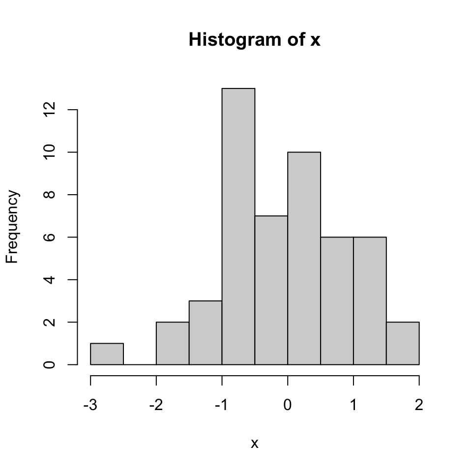
FIGURE 2.2: Histogram of values sampled from normal distribution.
We can modify all the plots by providing certain arguments to the plotting function. Now let’s give a title to the plot using the main argument. We can also change the color of the bars using the col argument. You can simply provide the name of the color. Below, we are using 'red' for the color. See Figure 2.3 for the result of this code chunk.
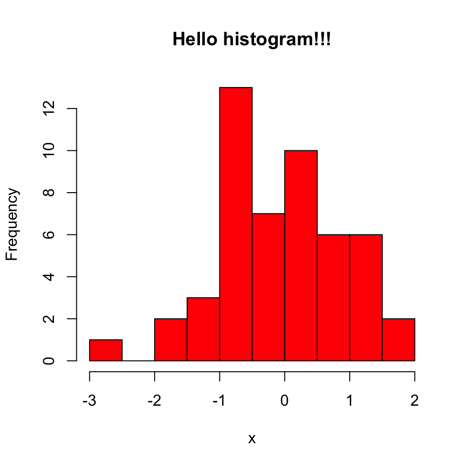
FIGURE 2.3: Histogram in red color.
Next, we will make a scatter plot. Scatter plots are one the most common plots you will encounter in data analysis. We will sample another set of 50 values and plot those against the ones we sampled earlier. The scatter plot shows values of two variables for a set of data points. It is useful to visualize relationships between two variables. It is frequently used in connection with correlation and linear regression. There are other variants of scatter plots which show density of the points with different colors. We will show examples of those scatter plots in later chapters. The scatter plot from our sampling experiment is shown in Figure 2.4. Notice that, in addition to main argument we used xlab and ylab arguments to give labels to the plot. You can customize the plots even more than this. See ?plot and ?par for more arguments that can help you customize the plots.
# randomly sample 50 points from normal distribution
y<-rnorm(50)
#plot a scatter plot
# control x-axis and y-axis labels
plot(x,y,main="scatterplot of random samples",
        ylab="y values",xlab="x values")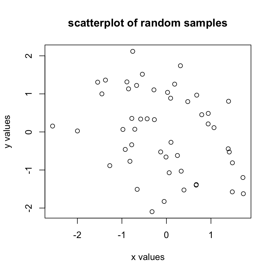
FIGURE 2.4: Scatter plot example.
We can also plot boxplots for vectors x and y. Boxplots depict groups of numerical data through their quartiles. The edges of the box denote the 1st and 3rd quartiles, and the line that crosses the box is the median. The distance between the 1st and the 3rd quartiles is called interquartile tange. The whiskers (lines extending from the boxes) are usually defined using the interquartile range for symmetric distributions as follows: lowerWhisker=Q1-1.5[IQR] and upperWhisker=Q3+1.5[IQR].
In addition, outliers can be depicted as dots. In this case, outliers are the values that remain outside the whiskers. The resulting plot from the code snippet below is shown in Figure 2.5.
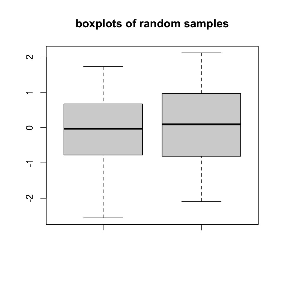
FIGURE 2.5: Boxplot example
Next up is the bar plot, which you can plot using the barplot() function. We are going to plot four imaginary percentage values and color them with two colors, and this time we will also show how to draw a legend on the plot using the legend() function. The resulting plot is in Figure 2.6.
perc=c(50,70,35,25)
barplot(height=perc,
        names.arg=c("CpGi","exon","CpGi","exon"),
        ylab="percentages",main="imagine %s",
        col=c("red","red","blue","blue"))
legend("topright",legend=c("test","control"),
       fill=c("red","blue"))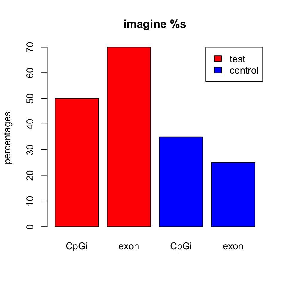
FIGURE 2.6: Bar plot example
2.7.1 Combining multiple plots
In R, we can combine multiple plots in the same graphic. For this purpose, we use the par() function for simple combinations. More complicated arrangements with different sizes of sub-plots can be created with the layout() function. Below we will show how to combine two plots side-by-side using par(mfrow=c(1,2)). The mfrow=c(nrows, ncols) construct will create a matrix of nrows x ncols plots that are filled in by row. The following code will produce a histogram and a scatter plot stacked side by side. The result is shown in Figure 2.7. If you want to see the plots on top of each other, simply change mfrow=c(1,2) to mfrow=c(2,1).
par(mfrow=c(1,2)) #

# make the plots
hist(x,main="Hello histogram!!!",col="red")
plot(x,y,main="scatterplot",
        ylab="y values",xlab="x values")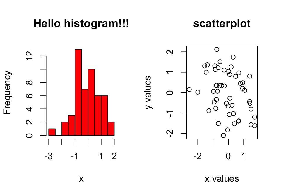
FIGURE 2.7: Combining two plots, a histogram and a scatter plot, with par() function.
2.7.2 Saving plots
If you want to save your plots to an image file there are couple of ways of doing that. Normally, you will have to do the following:
- Open a graphics device.
- Create the plot.
- Close the graphics device.
Alternatively, you can first create the plot then copy the plot to a graphics device.