9.5 ChIP quality control
While the goal of the read quality assessment is to check whether the sequencing produced a high enough number of high-quality reads the goal of ChIP quality control is to ascertain whether the chromatin immunoprecipitation enrichment was successful. This is a crucial step in the ChIP-seq analysis because it can help us identify low-quality ChIP samples, and give information about which experimental steps went wrong.
There are four steps in ChIP quality control:
Sample correlation clustering: Clustering of the pair-wise correlations between genome-wide signal profiles.
Data visualization in a genomic browser.
Average fragment length determination: Determining whether the ChIP was enriched for fragments of a certain length.
Visualization of GC bias. Here we will plot the ChIP enrichment versus the average GC content in the corresponding genomic bin.
9.5.1 The data
Here we will familiarize ourselves with the datasets that will be used in the chapter. Experimental data was downloaded from the public ENCODE (ENCODE Project Consortium 2012) database of ChIP-seq experiments. The experiments were performed on a lymphoblastoid cell line, GM12878, and mapped to the GRCh38 (hg38) version of the human genome, using the standard ENCODE ChIP-seq pipeline. In this chapter, due to compute time considerations, we have taken a subset of the data which corresponds to the human chromosome 21 (chr21).
The data sets are located in the compGenomRData package.
The location of the data sets can be accessed using the system.file() command,
in the following way:
The available datasets can be listed using the list.files() function:
The dataset consists of the following ChIP experiments:
Transcription factors: CTCF, SMC3, ZNF143, PolII (RNA polymerase 2)
Histone modifications: H3K4me3, H3K36me3, H3k27ac, H3k27me3
Various input samples
9.5.2 Sample clustering
Clustering is an ordering procedure which groups samples by similarity; the more similar samples are grouped closer to one another. The details of clustering methodologies are described in Chapter 4. Clustering of ChIP signal profiles is used for two purposes: The first one is to ascertain whether there is concordance between biological replicates; biological replicates should show greater similarity than ChIP of different proteins. The second function is to see whether our experiments conform to known prior knowledge. For example, we would expect to see greater similarity between proteins which belong to the same protein complex.
To quantify the ChIP signal we will firstly construct 1-kilobase-wide tilling windows over the genome, and subsequently count the number of reads in each window, for each experiment. We will then normalize the counts, to account for a different total number of reads in each experiment, and finally calculate the correlation between all pairs of samples. Although this procedure represents a crude way of data quantification, it provides sufficient information to ascertain the data quality.
Using the GenomeInfoDb we will first fetch the chromosome lengths corresponding
to the hg38 version of the human genome, and filter the length for human
chromosome 21.
# load the chromosome info package
library(GenomeInfoDb)

# fetch the chromosome lengths for the human genome
hg_chrs = getChromInfoFromUCSC('hg38')

# find the length of chromosome 21
hg_chrs = subset(hg_chrs, grepl('chr21$',chrom))
The tileGenome() function from the GenomicRanges package constructs equally sized
windows over the genome of interest.
The function takes two arguments:
A vector of chromosome lengths
Window size
Firstly, we convert the chromosome lengths data.frame into a named vector.
# downloaded hg_chrs is a data.frame object,
# we need to convert the data.frame into a named vector
seqlengths = with(hg_chrs, setNames(size, chrom))
Then we construct the windows.
# load the genomic ranges package
library(GenomicRanges)

# tileGenome function returns a list of GRanges of a given width,
# spanning the whole chromosome
tilling_window = tileGenome(seqlengths, tilewidth=1000)

# unlist converts the list to one GRanges object
tilling_window = unlist(tilling_window)
## GRanges object with 46710 ranges and 0 metadata columns:
## seqnames ranges strand
## <Rle> <IRanges> <Rle>
## [1] chr21 1-1000 *
## [2] chr21 1001-2000 *
## [3] chr21 2001-3000 *
## [4] chr21 3001-4000 *
## [5] chr21 4001-5000 *
## ... ... ... ...
## [46706] chr21 46704985-46705984 *
## [46707] chr21 46705985-46706984 *
## [46708] chr21 46706985-46707984 *
## [46709] chr21 46707985-46708984 *
## [46710] chr21 46708985-46709983 *
## -------
## seqinfo: 1 sequence from an unspecified genomeWe will use the summarizeOverlaps() function from the GenomicAlignments package
to count the number of reads in each genomic window.
The function will do the counting automatically for all our experiments.
The summarizeOverlaps() function returns a SummarizedExperiment object.
The object contains the counts, genomic ranges which were used for the quantification,
and the sample descriptions.
# load GenomicAlignments
library(GenomicAlignments)

# fetch bam files from the data folder
bam_files = list.files(
    path       = data_path,
    full.names = TRUE,
    pattern    = 'bam$'
)

# use summarizeOverlaps to count the reads
so = summarizeOverlaps(tilling_window, bam_files)

# extract the counts from the SummarizedExperiment
counts = assays(so)[[1]]
Different ChIP experiments were sequenced to different depths; each experiment contains a different number of reads. To remove the effect of the experimental depth on the quantification, the samples need to be normalized. The standard normalization procedure, for ChIP data, is to divide the counts in each tilling window by the total number of sequenced reads, and multiply it by a constant factor (to avoid extremely small numbers). This normalization procedure is called the cpm - counts per million.
\[ CPM = counts * (10^{6} / total\>number\>of\>reads) \]
# calculate the cpm from the counts matrix
# the following command works because
# R calculates everything by columns
cpm = t(t(counts)*(1000000/colSums(counts)))
We remove all tiles which do not have overlapping reads. Tiles with 0 counts do not provide any additional discriminatory power, rather, they introduce artificial similarity between the samples (i.e. samples with only a handful of bound regions will have a lot of tiles with \(0\) counts, while they do not have to have any overlapping enriched tiles).
We use the sub() function to shorten the column names of the cpm matrix.
# change the formatting of the column names
# remove the .chr21.bam suffix
colnames(cpm) = sub('.chr21.bam','',   colnames(cpm))

# remove the GM12878_hg38 prefix
colnames(cpm) = sub('GM12878_hg38_','',colnames(cpm))
Finally, we calculate the pairwise Pearson correlation coefficient using the
cor() function.
The function takes as input a region-by-sample count matrix, and returns
a sample X sample matrix, where each field contains the correlation coefficient
between two samples.
# calculates the pearson correlation coefficient between the samples
correlation_matrix = cor(cpm, method='pearson')
The Heatmap() function from the ComplexHeatmap (Z. Gu, Eils, and Schlesner 2016b) package is used to visualize
the correlation coefficient.
The function automatically performs hierarchical clustering - it groups the
samples which have the highest pairwise correlation.
The diagonal represents the correlation of each sample with itself.
# load ComplexHeatmap
library(ComplexHeatmap)

# load the circlize package, and define
# the color palette which will be used in the heatmap
library(circlize)
heatmap_col = circlize::colorRamp2(
    breaks = c(-1,0,1),
    colors = c('blue','white','red')
)

# plot the heatmap using the Heatmap function
Heatmap(
    matrix = correlation_matrix,
    col    = heatmap_col
)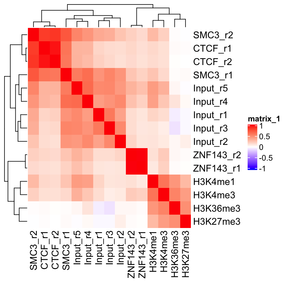
FIGURE 9.2: Heatmap showing ChIP-seq sample similarity using the Pearson correlation coefficient.
In Figure 9.2 we can see a perfect example of why quality control is important. CTCF is a zinc finger protein which co-localizes with the Cohesin complex. SMC3 is a sub unit of the Cohesin complex, and we would therefore expect to see that the SMC3 signal profile has high correlation with the CTCF signal profile. This is true for the second biological replicate of SMC3, while the first replicate (SMC3_r1) clusters with the input samples. This indicates that the sample likely has low enrichment. We can see that the ChIP and Input samples form separate clusters. This implies that the ChIP samples have an enrichment of fragments. Additionally, we see that the biological replicates of other experiments cluster together.
9.5.3 Visualization in the genome browser
One of the first steps in any ChIP-seq analysis should be looking at the data. By looking at the data we get an intuition about the quality of the experiment, and start seeing preliminary correlations between the samples, which we can use to guide our analysis. This can be achieved either by plotting signal profiles around regions of interest, or by loading data into a genome browser (such as IGV, or UCSC genome browsers).
Genome browsers are standalone applications which represent the genome as a one-dimensional (1D) coordinate system. The browsers enable simultaneous visualization and comparison of multiple types of annotations and experimental data.
Genome browsers can visualize most of the commonly used genomic data formats: BAM, BED, wig, and bigWig. The easiest way to access our data would be to load the .bam files into the browser. This will show us the sequence and position of every mapped read. If we want to view multiple samples in parallel, loading every mapped read can be restrictive. It takes up a lot of computational resources, and the amount of information makes the visual comparison hard to do. We would like to convert our data so that we get a compressed visualization, which would show us the main properties of our samples, namely, the quality and the location of the enrichment. This is achieved by summarizing the read enrichment into a signal profile - the whole experiment is converted into a numeric vector - a coverage vector. The vector contains information on how many reads overlap each position in the genome.
We will proceed as follows: Firstly, we will import a .bam file into R. Then we will calculate the signal profile (construct the coverage vector), and finally, we export the vector as a .bigWig file.
First we select one of the ChIP samples.
# list the bam files in the directory
# the '$' sign tells the pattern recognizer to omit bam.bai files
bam_files = list.files(
    path       = data_path,
    full.names = TRUE,
    pattern    = 'bam$'
)

# select the first bam file
chip_file = bam_files[1]
We will use the readGAlignments() function from the GenomicAlignments
package to load the reads into R, and then the GRanges() function
to convert them into a GRanges object.
# load the genomic alignments package
library(GenomicAlignments)

# read the ChIP reads into R
reads = readGAlignments(chip_file)

# the reads need to be converted to a granges object
reads = granges(reads)
Because DNA fragments are being sequenced from their ends (both the 3’ and 5’ end), the read enrichment does not correspond to the exact location of the bound protein. Rather, reads end to form clusters of enrichment upstream and downstream of the true binding location. To correct for this, we use a small hack. Before we create the signal profiles, we will extend the reads towards their 3’ end. The reads are extended to form fragments of 200 base pairs. This is an empiric measure, which corresponds to the average fragment size of the Illumina sample preparation kit. The exact average fragment size will differ from 200 base pairs, but if the deviation is not large (i.e. more than 200 base pairs), it will not affect the visual properties of our samples.
Read extension is done using the resize() function. The function
takes two arguments:
width: resulting fragment widthfix: which position of the fragment should not be changed (iffixis set to start, the reads will be extended towards the 3’ end. Iffixis set to end, they will be extended towards the 5’ end)
# extends the reads towards the 3' end
reads = resize(reads, width=200, fix='start')

# keeps only chromosome 21
reads = keepSeqlevels(reads, 'chr21', pruning.mode='coarse')
Conversion of reads into coverage vectors is done with the coverage()
function.
The function takes only one argument (width), which corresponds to chromosome sizes.
For this purpose we can use the, previously created, seqlengths variable.
The coverage() function converts the reads into a compressed Rle object. We have introduced these workflows in Chapter 6.
## RleList of length 1
## $chr21
## integer-Rle of length 46709983 with 199419 runs
##   Lengths: 5038228     200   63546      20 ...     200    1203     200   27856
##   Values :       0       1       0       1 ...       1       0       1       0
The name of the output file is created by changing the file suffix from .bam to .bigWig.
Now we can use the export.bw() function from the rtracklayer package to
write the bigWig file.
# load the rtracklayer package
library(rtracklayer)

# export the bigWig output file
export.bw(cov, 'output_file')
9.5.3.1 Vizualization of track data using Gviz
We can create genome browserlike visualizations using the Gviz package,
which was introduced in Chapter 6.
The Gviz is a tool which enables exhaustive customized visualization of
genomics experiments. The basic usage principle is to define tracks, where each track can represent
genomic annotation, or a signal profile; subsequently we define the order
of the tracks and plot them.
Here we will define two tracks, a genome axis, which will show the position
along the human chromosome 21; and a signal track from our CTCF experiment.
library(Gviz)
# define the genome axis track
axis   = GenomeAxisTrack(
    range = GRanges('chr21', IRanges(1, width=seqlengths))
)

# convert the signal into genomic ranges and define the signal track
gcov   = as(cov, 'GRanges')
dtrack = DataTrack(gcov, name = "CTCF", type='l')

# define the track ordering
track_list = list(axis,dtrack)
Tracks are plotted with the plotTracks() function. The sizes argument needs to be the same size as the track_list, and defines the
relative size of each track.
Figure 9.3 shows the output of the
plotTracks() function.
# plot the list of browser tracks
# sizes argument defines the relative sizes of tracks
# background title defines the color for the track labels
plotTracks(
    trackList        = track_list,
    sizes            = c(.1,1),
    background.title = "black"
)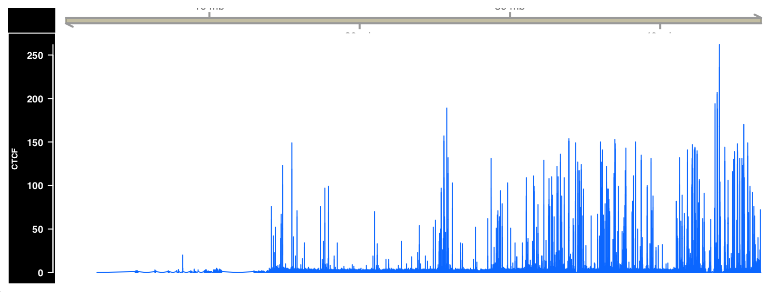
FIGURE 9.3: ChIP-seq signal visualized as a browser track using Gviz.
9.5.4 Plus and minus strand cross-correlation
Cross-correlation between plus and minus strands is a method which quantifies whether the DNA library was enriched for fragments of a certain length.
Similarity between the plus and minus strands defined as the correlation of the signal profiles for the reads that map to the + and the - strands. The distribution of reads is shown in Figure 9.4.
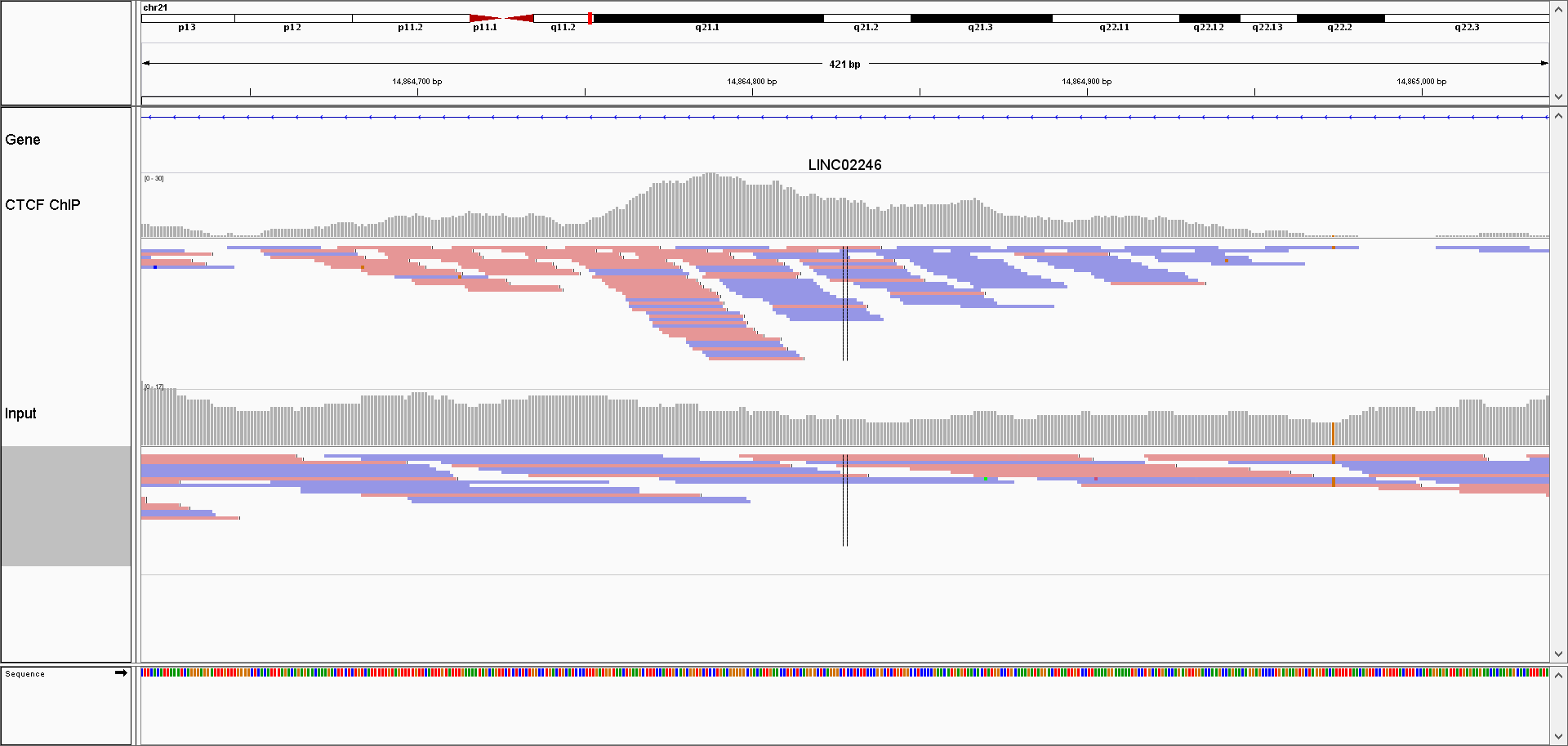
FIGURE 9.4: Browser screenshot of aligned reads for one ChIP, and control sample. ChIP samples have an asymetric distribution of reads; reads mapping to the + strand are located on the left side of the peak, while the reads mapping to the - strand are found on the right side of the peak.
Due to the sequencing properties, reads which correspond to the 5’ fragment ends will map to the opposite strand from the reads coming from the 3’ ends. Most often (depending on the sequencing protocol) the reads from the 5’ fragment ends map to the + strand, while the reads from the 3’ ends map to the - strand.
We calculate the cross-correlation by shifting the signal on the + strand, by a pre-defined amount (i.e. shift by 1 - 400 nucleotides), and calculating, for each shift, the correlation between the +, and the - strands. Subsequently we plot the correlation versus shift, and locate the maximum value. The maximum value should correspond to the average DNA fragment length which was present in the library. This value tells us whether the ChIP enriched for fragments of certain length (i.e. whether the ChIP was successful).
Due to the size of genomic data, it might be computationally prohibitive to calculate the Pearson correlation between whole genome (or even whole chromosome) signal profiles. To get around this problem, we will resort to a trick; we will disregard the dynamic range of the signal profiles, and only keep the information of which genomic bases contained the ends of the fragments. This is done by calculating the coverage vector of the read starting position (separately for each strand), and converting the coverage vector into a Boolean vector. The Boolean vector contains the information of which genomic positions contained the DNA fragment ends.
Similarity between two Boolean vectors can be promptly computed using the Jaccard index. The Jaccard index is defined as an intersection between two Boolean vectors, divided by their union as shown in Figure 9.5.
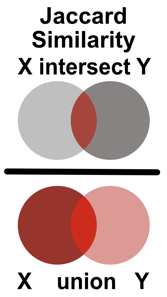
FIGURE 9.5: Jaccard similarity is defined as the ratio of the intersection and union of two sets.
Firstly, we load the reads for one of the CTCF ChIP experiments. Then we create signal profiles, separately for reads on the + and - strands. Unlike before, we do not extend the reads to the average expected fragment length (200 base pairs); we keep only the starting position of each read.
# load the reads
reads = readGAlignments(chip_file)
reads = granges(reads)

# keep only the starting position of each read
reads = resize(reads, width=1, fix='start')

reads = keepSeqlevels(reads, 'chr21', pruning.mode='coarse')
Now we can calculate the coverage vector of the read starting position. The coverage vector is then automatically converted into a Boolean vector by asking which genomic positions have \(coverage > 0\).
# calculate the coverage profile for plus and minus strand
reads = split(reads, strand(reads))

# coverage(x, width = seqlengths)[[1]] > 0
# calculates the coverage and converts
# the coverage vector into a boolean
cov   = lapply(reads, function(x){
    coverage(x, width = seqlengths)[[1]] > 0
})
cov   = lapply(cov, as.vector)
We will now shift the coverage vector from the plus strand by \(1\) to \(400\) base pairs, and for each pair shift we will calculate the Jaccard index between the vectors on the plus and minus strand.
# defines the shift range
wsize = 1:400

# defines the jaccard similarity
jaccard = function(x,y)sum((x & y)) / sum((x | y))

# shifts the + vector by 1 - 400 nucleotides and
# calculates the correlation coefficient
cc = shiftApply(
    SHIFT = wsize,
    X     = cov[['+']],
    Y     = cov[['-']],
    FUN   = jaccard
)

# converts the results into a data frame
cc = data.frame(fragment_size = wsize, cross_correlation = cc)
We can finally plot the shift in base pairs versus the correlation coefficient:
library(ggplot2)
ggplot(data = cc, aes(fragment_size, cross_correlation)) +
    geom_point() +
    geom_vline(xintercept = which.max(cc$cross_correlation),
               size=2, color='red', linetype=2) +
    theme_bw() +
    theme(
        axis.text = element_text(size=10, face='bold'),
        axis.title = element_text(size=14,face="bold"),
        plot.title = element_text(hjust = 0.5)) +
    xlab('Shift in base pairs') +
ylab('Jaccard similarity') 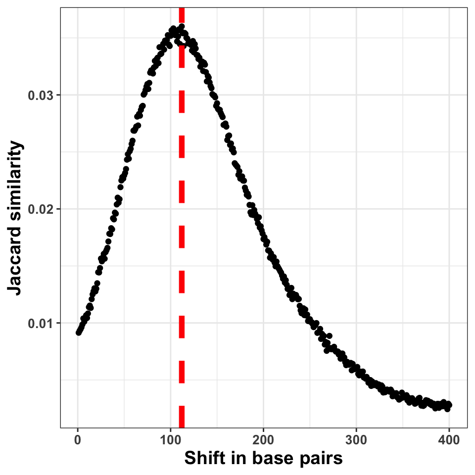
FIGURE 9.6: The figure shows the correlation coefficient between the ChIP-seq signal on + and \(-\) strands. The peak of the distribution designates the fragment size
Figure 9.6 shows the shift in base pairs, which corresponds to the maximum value of the correlation coefficient gives us an approximation to the expected average DNA fragment length. Because this value is not 0, or monotonically decreasing, we can conclude that there was substantial enrichment of certain fragments in the ChIP samples.
9.5.5 GC bias quantification
The PCR amplification procedure can cause a significant bias in the ChIP experiments. The bias can be influenced by the DNA fragment size distribution, sequence composition, hexamer distribution of PCR primers, and the number of cycles used for the amplification. One way to determine whether some of the samples have significantly different sequence composition is to look at whether regions with differing GC composition were equally enriched in all experiments.
We will do the following: Firstly we will calculate the GC content of each of the tilling windows, and then we will compare the GC content with the corresponding cpm (count per million reads) value, for each tile.
# fetches the chromosome lengths and constructs the tiles
library(GenomeInfoDb)
library(GenomicRanges)

hg_chrs        = getChromInfoFromUCSC('hg38')
hg_chrs        = subset(hg_chrs, grepl('chr21$',chrom))
seqlengths     = with(hg_chrs, setNames(size, chrom))

# tileGenome produces a list per chromosome
# unlist combines the elemenents of the list
# into one GRanges object
tilling_window = unlist(tileGenome(
    seqlengths = seqlengths,
    tilewidth  = 1000
))
We will extract the sequence information from the BSgenome.Hsapiens.UCSC.hg38
package. BSgenome are generic Bioconductor containers for genomic sequences.
Sequences are extracted from the BSgenome container using the getSeq() function.
The getSeq() function takes as input the genome object, and the ranges with the
regions of interest; in our case, the tilling windows.
The function returns a DNAString object.
# loads the human genome sequence
library(BSgenome.Hsapiens.UCSC.hg38)

# extracts the sequence from the human genome
seq = getSeq(BSgenome.Hsapiens.UCSC.hg38, tilling_window)
To calculate the GC content, we will use the oligonucleotideFrequency() function on the
DNAString object. By setting the width parameter to 2 we will
calculate the dinucleotide frequency.
Each row in the resulting table will contain the number of all possible
dinucleotides observed in each tilling window.
Because we have tilling windows of the same length, we do not
necessarily need to normalize the counts by the window length.
If all of the windows have different lengths (i.e. when at the ChIP-seq peaks), then normalization is a prerequisite.
# calculates the frequency of all possible dimers
# in our sequence set
nuc = oligonucleotideFrequency(seq, width = 2)

# converts the matrix into a data.frame
nuc = as.data.frame(nuc)

# calculates the percentages, and rounds the number
nuc = round(nuc/1000,3)
Now we can combine the GC frequency with the cpm values. We will convert the cpm values to the log10 scale. To avoid taking the \(log(0)\), we add a pseudo count of 1 to cpm.
# counts the number of reads per tilling window
# for each experiment
so = summarizeOverlaps(tilling_window, bam_files)

# converts the raw counts to cpm values
counts  = assays(so)[[1]]
cpm     = t(t(counts)*(1000000/colSums(counts)))

# because the cpm scale has a large dynamic range
# we transform it using the log function
cpm_log = log10(cpm+1)
Combine the cpm values with the GC content,
and plot the results.
ggplot(
    data = gc,
    aes(
        x = GC,
        y = GM12878_hg38_CTCF_r1.chr21.bam
    )) +
  geom_point(size=2, alpha=.3) +
  theme_bw() +
  theme(
    axis.text  = element_text(size=10, face='bold'),
    axis.title = element_text(size=14,face="bold"),
    plot.title = element_text(hjust = 0.5)) +
  xlab('GC content in one kilobase windows') +
  ylab('log10( cpm + 1 )') +
  ggtitle('CTCF Replicate 1')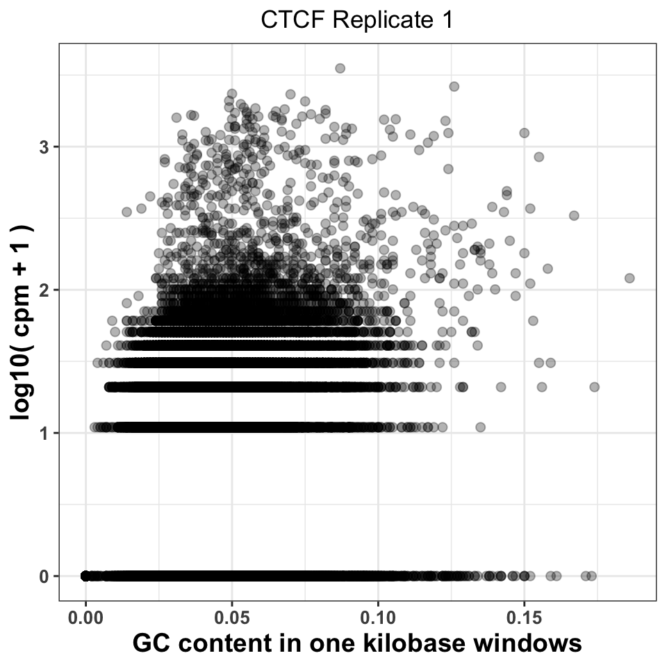
FIGURE 9.7: GC content abundance in a ChIP-seq experiment.
Figure 9.7 visualizes the CPM versus GC content, and gives us two important pieces of information. Firstly, it shows whether there was a specific amplification of regions with extremely high or extremely low GC content. This would be a strong indication that either the PCR or the size selection procedure were not successfully executed. The second piece of information comes by comparison of plots corresponding to multiple experiments. If different ChIP-samples have highly diverging enrichment of different ChIP regions, then some of the samples were affected by unknown batch effects. Such effects need to be taken into account in downstream analysis.
Firstly, we will reorder the columns of the data.frame using the pivot_longer()
function from the tidyr package.
# load the tidyr package
library(tidyr)

# pivot_longer converts a fat data.frame into a tall data.frame,
# which is the format used by the ggplot package
gcd = pivot_longer(
    data      = gc,
    cols      = -GC,
    names_to  = 'experiment',
    values_to = 'cpm'
)

# we select the ChIP files corresponding to the ctcf experiment
gcd = subset(gcd, grepl('CTCF', experiment))

# remove the chr21 suffix
gcd$experiment = sub('chr21.','',gcd$experiment)
We can now visualize the relationship using a scatter plot. Figure 9.8 compares the GC content dependency on the CPM between the first and the second CTCF replicate. In this case, the replicate looks similar.
ggplot(data = gcd, aes(GC, log10(cpm+1))) +
  geom_point(size=2, alpha=.05) +
  theme_bw() +
  facet_wrap(~experiment, nrow=1)+
  theme(
    axis.text = element_text(size=10, face='bold'),
    axis.title = element_text(size=14,face="bold"),
    plot.title = element_text(hjust = 0.5)) +
  xlab('GC content in one kilobase windows') +
  ylab('log10( cpm + 1 )') +
  ggtitle('CTCF Replicates 1 and 2')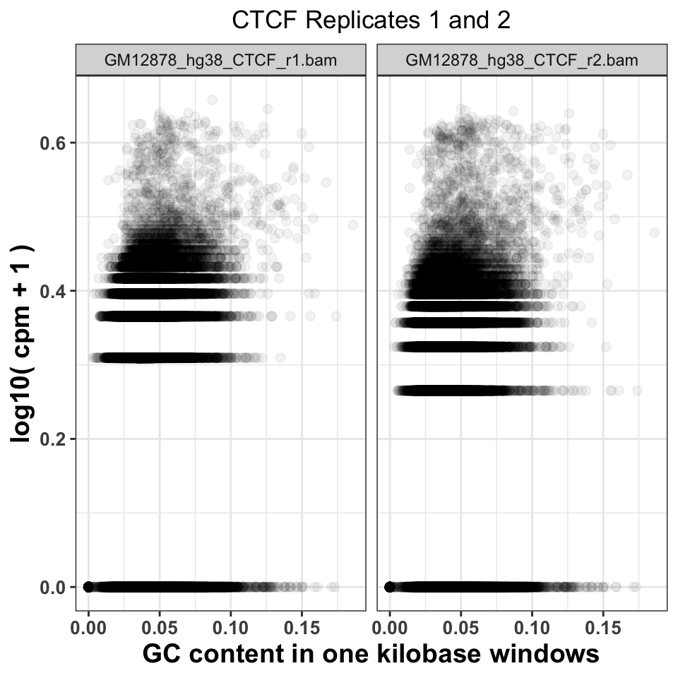
FIGURE 9.8: Comparison of GC content and signal abundance between two CTCF biological replicates
9.5.6 Sequence read genomic distribution
The fourth way to look at the ChIP quality control is to visualize the genomic distribution of reads in different functional genomic regions. If the ChIP samples have the same distribution of reads as the Input samples, this implies a lack of specific enrichment. Additionally, if we have prior knowledge of where our proteins should be located, we can use the visualization to judge how well the genomic distributions conform to our priors. For example, the trimethylation of histone H3 on lysine 36 - H3K36me3 is associated with elongating polymerase and productive transcription. If we performed a successful ChIP experiment with an anti-H3K36me3 antibody, we would expect most of the reads to fall within gene bodies (introns and exons).
9.5.6.1 Hierarchical annotation of genomic features
Overlapping genomic features (a transcription start site of one gene might be in an intron of another gene) will cause an ambiguity during the read annotation. If a read overlaps more than one functional category, we are not certain which category it should be assigned to. To solve the problem of multiple assignments, we need to construct a set of annotation rules. A heuristic solution is to organize the genomic annotation into a hierarchy which will imply prioritization. We can then look, for each read, which functional categories it overlaps, and if it is within multiple categories, we assign the read to the topmost category. As an example, let’s say that we have 4 genomic categories: 1) TSS (transcription start sites), 2) exon, 3) intron, and 4) intergenic with the following hierarchy: TSS -> exon -> intron -> intergenic. This means that if a read overlaps a TSS and an intron, it will be annotated as TSS. This approach is shown in Figure 9.9.
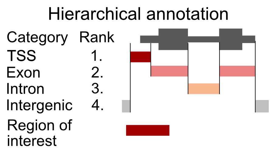
FIGURE 9.9: Principle of hierarchical annotation. The region of interest is annotated as the topmost ranked category that it overlaps. In this case, our region overlaps a TSS, an exon, and an intergenic region. Because the TSS has the topmost rank, it is annotated as a TSS.
Now we will construct the set of functional genomic regions, and annotate the reads.
9.5.6.2 Finding annotations
There are multiple sources of genomic annotation. UCSC, Genbank, and Ensembl databases represent stable resources, from which the annotation can be easily obtained.
AnnotationHub is a Bioconductor-based online resource which contains a large number of experiments from various
sources. We will use the AnnotationHub to download the location of
genes corresponding to the hg38 genome. The hub is accessed in the following way:
# load the AnnotationHub package
library(AnnotationHub)

# connect to the hub object
hub = AnnotationHub()
The hub variable contains the programming interface towards the online database. We can use the query() function to find out the ID of the
“ENSEMBL” gene annotation.
# query the hub for the human annotation
AnnotationHub::query(
    x       = hub,
    pattern = c('ENSEMBL','Homo','GRCh38','chr','gtf')
)
## AnnotationHub with 32 records
## # snapshotDate(): 2020-04-27
## # $dataprovider: Ensembl
## # $species: Homo sapiens
## # $rdataclass: GRanges
## # additional mcols(): taxonomyid, genome, description,
## # coordinate_1_based, maintainer, rdatadateadded, preparerclass, tags,
## # rdatapath, sourceurl, sourcetype
## # retrieve records with, e.g., 'object[["AH50842"]]'
##
## title
## AH50842 | Homo_sapiens.GRCh38.84.chr.gtf
## AH50843 | Homo_sapiens.GRCh38.84.chr_patch_hapl_scaff.gtf
## AH51012 | Homo_sapiens.GRCh38.85.chr.gtf
## AH51013 | Homo_sapiens.GRCh38.85.chr_patch_hapl_scaff.gtf
## AH51953 | Homo_sapiens.GRCh38.86.chr.gtf
## ... ...
## AH75392 | Homo_sapiens.GRCh38.98.chr_patch_hapl_scaff.gtf
## AH79159 | Homo_sapiens.GRCh38.99.chr.gtf
## AH79160 | Homo_sapiens.GRCh38.99.chr_patch_hapl_scaff.gtf
## AH80075 | Homo_sapiens.GRCh38.100.chr.gtf
## AH80076 | Homo_sapiens.GRCh38.100.chr_patch_hapl_scaff.gtfWe are interested in the version GRCh38.92, which is available under AH61126.
To download the data from the hub, we use the [[ operator on the
hub API.
We will download the annotation in the GTF format, into a GRanges object.
## GRanges object with 6 ranges and 3 metadata columns:
##       seqnames      ranges strand |   source       type     score
##          <Rle>   <IRanges>  <Rle> | <factor>   <factor> <numeric>
##   [1]        1 11869-14409      + |   havana gene              NA
##   [2]        1 11869-14409      + |   havana transcript        NA
##   [3]        1 11869-12227      + |   havana exon              NA
##   [4]        1 12613-12721      + |   havana exon              NA
##   [5]        1 13221-14409      + |   havana exon              NA
##   [6]        1 12010-13670      + |   havana transcript        NA
##   -------
##   seqinfo: 25 sequences (1 circular) from GRCh38 genome
By default the ENSEMBL project labels chromosomes using numeric identifiers (i.e. 1,2,3 … X),
without the chr prefix.
We need to therefore append the prefix to the chromosome names (seqlevels).
pruning.mode = 'coarse' designates that the chromosome names will be replaced
in the gtf object.
# extract ensemel chromosome names
ensembl_seqlevels = seqlevels(gtf)

# paste the chr prefix to the chromosome names
ucsc_seqlevels    = paste0('chr', ensembl_seqlevels)

# replace ensembl with ucsc chromosome names
seqlevels(gtf, pruning.mode='coarse') = ucsc_seqlevels
And finally we subset only regions which correspond to chromosome 21.
9.5.6.3 Constructing genomic annotation
Once we have downloaded the annotation we can define the functional hierarchy. We will use the previously mentioned ordering: TSS -> exon -> intron -> intergenic, with TSS having the highest priority and the intergenic regions having the lowest priority.
# construct a GRangesList with human annotation
annotation_list = GRangesList(

    # promoters function extends the gtf around the TSS
    # by an upstream and downstream amounts
    tss    = promoters(
        x = subset(gtf, type=='gene'),
        upstream   = 1000,
        downstream = 1000),
    exon   = subset(gtf, type=='exon'),
    intron = subset(gtf, type=='gene')
)
9.5.6.4 Annotating reads
To annotate the reads we will define a function that takes as input a .bam file, and an annotation list, and returns the frequency of reads in each genomic category. We will then loop over all of the .bam files to annotate each experiment.
The annotateReads() function works in the following way:
- Load the .bam file.
- Find overlaps between the reads and the annotation categories.
- Arrange the annotated reads based on the hierarchy, and remove duplicated assignments.
- Count the number of reads in each category.
The crucial step to understand here is using the arrange() and filter() functions to keep only one annotated category per read.
annotateReads = function(bam_file, annotation_list){

    library(dplyr)
    message(basename(bam_file))

    # load the reads into R
    bam    = readGAlignments(bam_file)

    # find overlaps between reads and annotation
    result = as.data.frame(
        findOverlaps(bam, annotation_list)
    )

    # appends to the annotation index the corresponding
    # annotation name
    annotation_name   = names(annotation_list)[result$subjectHits]
    result$annotation = annotation_name

    # order the overlaps based on the hierarchy
    result = result[order(result$subjectHits),]

    # select only one category per read
    result = subset(result, !duplicated(queryHits))

    # count the number of reads in each category
    # group the result data frame by the corresponding category
    result = group_by(.data=result, annotation)

    # count the number of reads in each category
    result = summarise(.data = result, counts = length(annotation))

    # classify all reads which are outside of
    # the annotation as intergenic
    result = rbind(
        result,
        data.frame(
                annotation = 'intergenic',
                counts     = length(bam) - sum(result$counts)
            )
        )

    # calculate the frequency
    result$frequency  = with(result, round(counts/sum(counts),2))

    # append the experiment name
    result$experiment = basename(bam_file)

    return(result)
}
We execute the annotation function on all files.
# list all bam files in the folder
bam_files   = list.files(data_path, full.names=TRUE, pattern='bam$')

# calculate the read distribution for every file
annot_reads_list = lapply(bam_files, function(x){
    annotateReads(
        bam_file        = x,
        annotation_list = annotation_list
    )
})
First, we combine the results in one data frame, and reformat the experiment names.
# collapse the per-file read distributions into one data.frame
annot_reads_df = dplyr::bind_rows(annot_reads_list)

# format the experiment names
experiment_name = annot_reads_df$experiment
experiment_name = sub('.chr21.bam','', experiment_name)
experiment_name = sub('GM12878_hg38_','',experiment_name)
annot_reads_df$experiment = experiment_name
And plot the results.
ggplot(data = annot_reads_df,
       aes(
           x    = experiment,
           y    = frequency,
           fill = annotation
        )) +
    geom_bar(stat='identity') +
    theme_bw() +
    scale_fill_brewer(palette='Set2') +
    theme(
        axis.text = element_text(size=10, face='bold'),
        axis.title = element_text(size=14,face="bold"),
        plot.title = element_text(hjust = 0.5),
        axis.text.x = element_text(angle = 90, hjust = 1)) +
    xlab('Sample') +
    ylab('Percentage of reads') +
    ggtitle('Percentage of reads in annotation')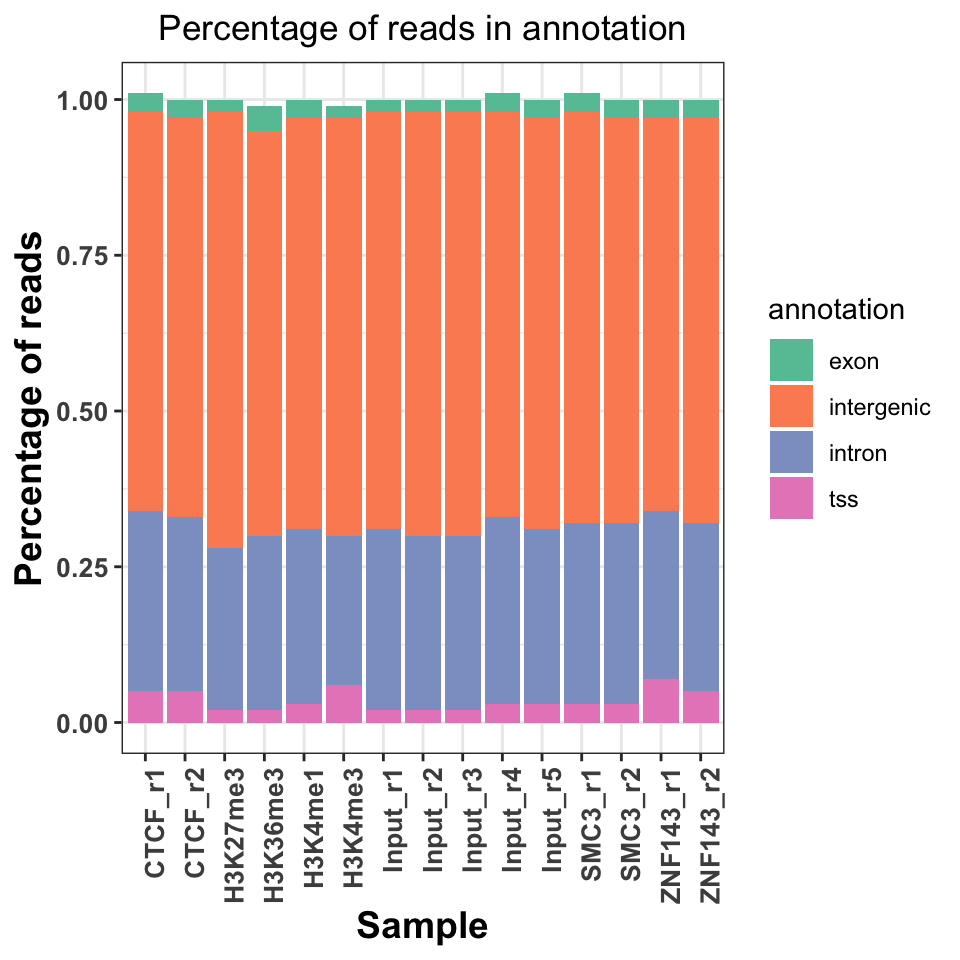
FIGURE 9.10: Read distribution in genomice functional annotation categories.
Figure 9.10 shows a slight increase of H3K36me3 on the exons and introns, and H3K4me3 on the TSS. Interestingly, both replicates of the ZNF143 transcription factor show increased read abundance around the TSS.
References
ENCODE Project Consortium. 2012. “An Integrated Encyclopedia of DNA Elements in the Human Genome.” Nature 489 (7414): 57–74.
Gu, Eils, and Schlesner. 2016b. “Complex Heatmaps Reveal Patterns and Correlations in Multidimensional Genomic Data.” Bioinformatics.