6.5 Visualizing and summarizing genomic intervals
Data integration and visualization is cornerstone of genomic data analysis. Below, we will show different ways of integrating and visualizing genomic intervals. These methods can be used to visualize large amounts of data in a locus-specific or multi-loci manner.
6.5.1 Visualizing intervals on a locus of interest
Oftentimes, we will be interested in a particular genomic locus and try to visualize
different genomic datasets over that locus. This is similar to looking at the data
over one of the genome browsers. Below we will display genes, GpG islands and read
coverage from a ChIP-seq experiment using the Gviz package. For the Gviz package, we first need to
set the tracks to display. The tracks can be in various formats. They can be R
objects such as IRanges,GRanges and data.frame, or they can be in flat file formats
such as bigWig, BED, and BAM. After the tracks are set, we can display them with the
plotTracks function, the resulting plot is shown in Figure 6.6.
library(Gviz)
# set tracks to display

# set CpG island track
cpgi.track=AnnotationTrack(cpgi.gr,
                           name = "CpG")

# set gene track
# we will get this from EBI Biomart webservice
gene.track <- BiomartGeneRegionTrack(genome = "hg19",
                                    chromosome = "chr21",
                                    start = 27698681, end = 28083310,
                                    name = "ENSEMBL")


# set track for ChIP-seq coverage
chipseqFile=system.file("extdata",
                      "wgEncodeHaibTfbsA549.chr21.bw",
                      package="compGenomRData")
cov.track=DataTrack(chipseqFile,type = "l",
                    name="coverage")

# call the display function plotTracks
track.list=list(cpgi.track,gene.track,cov.track)
plotTracks(track.list,from=27698681,to=28083310,chromsome="chr21")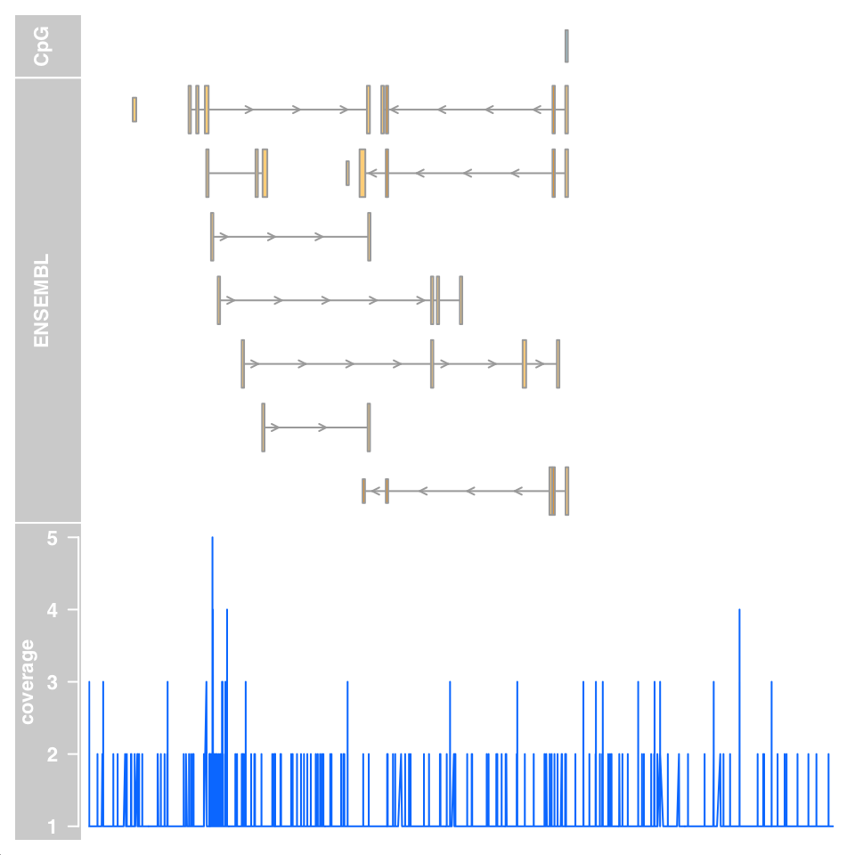
FIGURE 6.6: Genomic data tracks visualized using the Gviz functions.
6.5.2 Summaries of genomic intervals on multiple loci
Looking at data one region at a time could be inefficient. One can summarize
different data sets over thousands of regions of interest and identify patterns.
These summaries can include different data types such as motifs, read coverage
and other scores associated with genomic intervals. The genomation package can
summarize and help identify patterns in the datasets. The datasets can have
different kinds of information and multiple file types can be used such as BED, GFF, BAM and bigWig. We will look at H3K4me3 ChIP-seq and DNAse-seq signals from the H1 embryonic stem cell line. H3K4me3 is usually associated with promoters and regions with high DNAse-seq signal are associated with accessible regions, which means mostly regulatory regions. We will summarize those datasets around the transcription start sites (TSS) of genes on chromosome 20 of the human hg19 assembly. We will first read the genes and extract the region around the TSS, 500bp upstream and downstream. We will then create a matrix of ChIP-seq scores for those regions. Each row will represent a region around a specific TSS and columns will be the scores per base. We will then plot average enrichment values around the TSS of genes on chromosome 20.
# get transcription start sites on chr20
library(genomation)
transcriptFile=system.file("extdata",
                      "refseq.hg19.chr20.bed",
                      package="compGenomRData")
feat=readTranscriptFeatures(transcriptFile,
                            remove.unusual = TRUE,
                            up.flank = 500, down.flank = 500)
prom=feat$promoters # get promoters from the features


# get for H3K4me3 values around TSSes
# we use strand.aware=TRUE so - strands will
# be reversed
H3K4me3File=system.file("extdata",
                      "H1.ESC.H3K4me3.chr20.bw",
                      package="compGenomRData")
sm=ScoreMatrix(H3K4me3File,prom,
               type="bigWig",strand.aware = TRUE)


# look for the average enrichment
plotMeta(sm, profile.names = "H3K4me3", xcoords = c(-500,500),
         ylab="H3K4me3 enrichment",dispersion = "se",
         xlab="bases around TSS")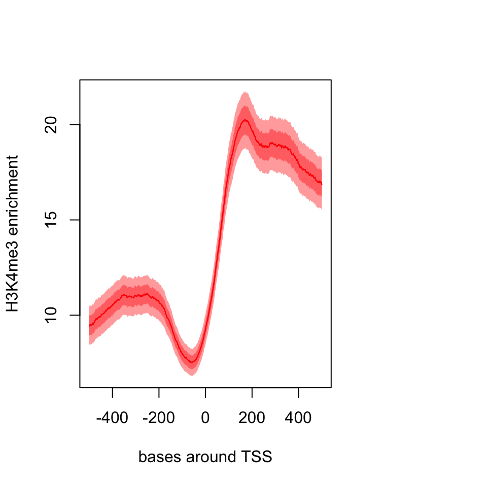
FIGURE 6.7: Meta-region plot using genomation.
The resulting plot is shown in Figure 6.7. The pattern we see is expected, there is a dip just around TSS and the signal is more intense downstream of the TSS.
We can also plot a heatmap where each row is a
region around the TSS and color coded by enrichment. This can show us not only the
general pattern, as in the meta-region
plot, but also how many of the regions produce such a pattern. The heatMatrix() function shown below achieves that. The resulting heatmap plot is shown in Figure 6.8.
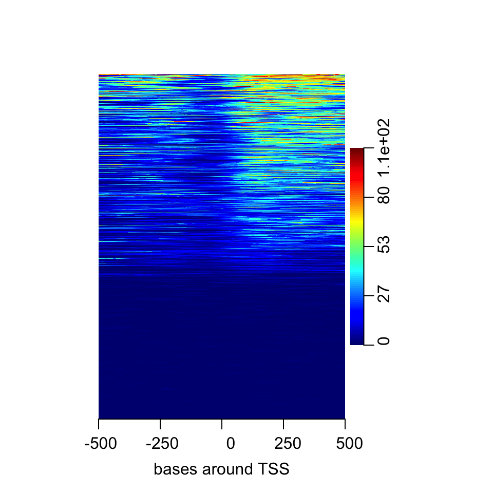
FIGURE 6.8: Heatmap of enrichment of H3K4me2 around the TSS.
Here we saw that about half of the regions do not have any signal. In addition it seems the multi-modal profile we have observed earlier is more complicated. Certain regions seem to have signal on both sides of the TSS, whereas others have signal mostly on the downstream side.
Normally, there would be more than one experiment or we can integrate datasets from public repositories. In this case, we can see how different signals look in the regions we are interested in. Now, we will also use DNAse-seq data and create a list of matrices with our datasets and plot the average profile of the signals from both datasets. The resulting meta-region plot is shown in Figure 6.9.
DNAseFile=system.file("extdata",
                      "H1.ESC.dnase.chr20.bw",
                      package="compGenomRData")

sml=ScoreMatrixList(c(H3K4me3=H3K4me3File,
                      DNAse=DNAseFile),prom,
                      type="bigWig",strand.aware = TRUE)
plotMeta(sml)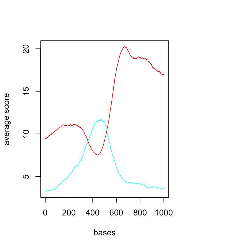
FIGURE 6.9: Average profiles of DNAse and H3K4me3 ChIP-seq.
We should now look at the heatmaps side by side and we should also cluster the rows
based on their similarity. We will be using multiHeatMatrix since we have multiple ScoreMatrix objects in the list. In this case, we will also use the winsorize argument to limit extreme values,
every score above 95th percentile will be equalized the value of the 95th percentile. In addition, heatMatrix and multiHeatMatrix can cluster the rows.
Below, we will be using k-means clustering with 3 clusters.
set.seed(1029)
multiHeatMatrix(sml,order=TRUE,xcoords = c(-500,500),
                xlab="bases around TSS",winsorize = c(0,95),
                matrix.main = c("H3K4me3","DNAse"),
                column.scale=TRUE,
                clustfun=function(x) kmeans(x, centers=3)$cluster)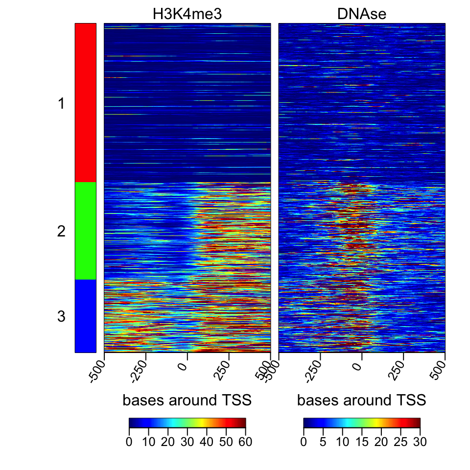
FIGURE 6.10: Heatmaps of H3K4me3 and DNAse data.
The resulting heatmaps are shown in Figure 6.10. These plots revealed a different picture than we have observed before. Almost half of the promoters have no signal for DNAse or H3K4me3; these regions are probably not active and associated genes are not expressed. For regions with the H3K4me3 signal, there are two major patterns: one pattern where both downstream and upstream of the TSS are enriched, and on the other pattern, mostly downstream of the TSS is enriched.
6.5.3 Making karyograms and circos plots
Chromosomal karyograms and circos plots are beneficial for displaying data over the
whole genome of chromosomes of interest, although the information that can be
displayed over these large regions are usually not very clear and only large trends
can be discerned by eye, such as loss of methylation in large regions or genome-wide.
Below, we show how to use the ggbio package for plotting.
This package has a slightly different syntax than base graphics. The syntax follows
“grammar of graphics” logic, and depends on the ggplot2 package we introduced in Chapter 2. It is
a deconstructed way of thinking about the plot. You add your data and apply mappings
and transformations in order to achieve the final output. In ggbio, things are
relatively easy since a high-level function, the autoplot function, will recognize
most of the datatypes and guess the most appropriate plot type. You can change
its behavior by applying low-level functions. We first get the sizes of chromosomes
and make a karyogram template. The empty karyogram is shown in Figure 6.11.
library(ggbio)
data(ideoCyto, package = "biovizBase")
p <- autoplot(seqinfo(ideoCyto$hg19), layout = "karyogram")
p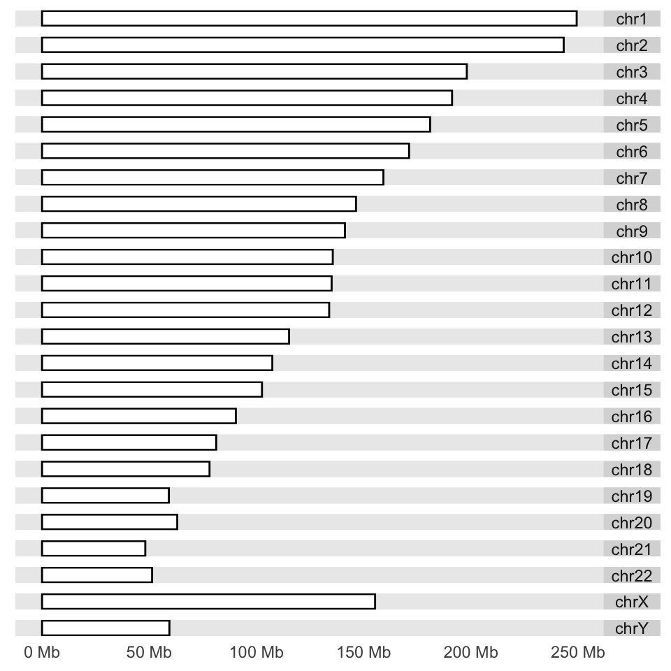
FIGURE 6.11: Karyogram example.
Next, we would like to plot CpG islands on this karyogram. We simply do this
by adding a layer with the layout_karyogram() function. The resulting karyogram is shown in Figure 6.12.
# read CpG islands from a generic text file

CpGiFile=filePath=system.file("extdata",
                      "CpGi.hg19.table.txt",
                      package="compGenomRData")
cpgi.gr=genomation::readGeneric(CpGiFile,
            chr = 1, start = 2, end = 3,header=TRUE,
          keep.all.metadata =TRUE,remove.unusual=TRUE )

p + layout_karyogram(cpgi.gr)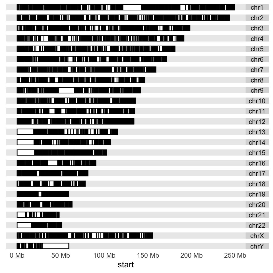
FIGURE 6.12: Karyogram of CpG islands over the human genome.
Next, we would like to plot some data over the chromosomes. This could be the ChIP-seq
signal
or any other signal over the genome; we will use CpG island scores from the data set
we read earlier. We will plot a point proportional to “obsExp” column in the data set. We use the ylim argument to squish the chromosomal rectangles and plot on top of those. The aes argument defines how the data is mapped to geometry. In this case,
the argument indicates that the points will have an x coordinate from CpG island start positions and a y coordinate from the obsExp score of CpG islands. The resulting karyogram is shown in Figure 6.13.
p + layout_karyogram(cpgi.gr, aes(x= start, y = obsExp),
                     geom="point",
                     ylim = c(2,50), color = "red",
                     size=0.1,rect.height=1)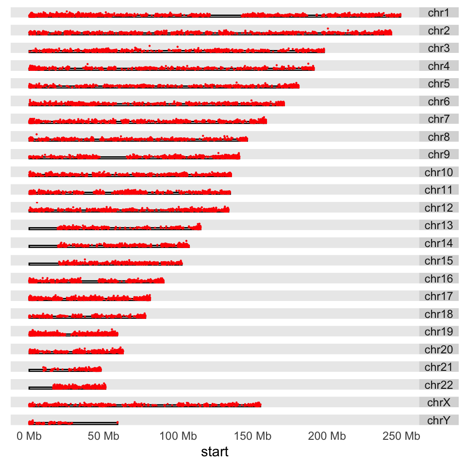
FIGURE 6.13: Karyogram of CpG islands and their observed/expected scores over the human genome.
Another way to depict regions or quantitative signals on the chromosomes is circos plots. These are circular plots usually used for showing chromosomal rearrangements, but can also be used for depicting signals. The ggbio package can produce all kinds of circos plots. Below, we will show how to use that for our CpG island score example, and the resulting plot is shown in Figure 6.14.
# set the chromsome in a circle
# color set to white to look transparent
p <- ggplot() + layout_circle(ideoCyto$hg19, geom = "ideo", fill = "white",
                              colour="white",cytoband = TRUE,
                              radius = 39, trackWidth = 2)
# plot the scores as points
p <- p + layout_circle(cpgi.gr, geom = "point", grid=TRUE,
                           size = 0.01, aes(y = obsExp),color="red",
                       radius = 42, trackWidth = 10)
# set the chromosome names
p <- p + layout_circle(as(seqinfo(ideoCyto$hg19),"GRanges"),
                       geom = "text", aes(label = seqnames),
                      vjust = 0, radius = 55, trackWidth = 7,
                      size=3)

# display the plot
p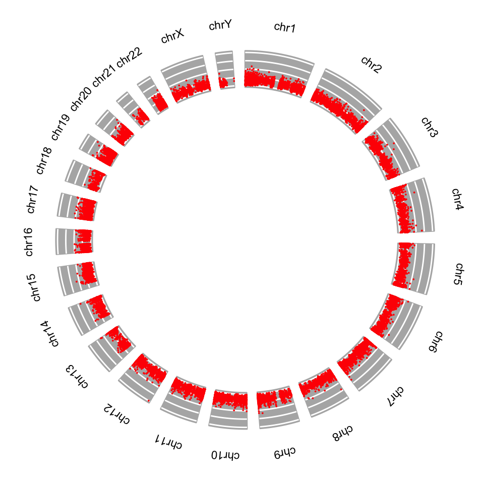
FIGURE 6.14: Circos plot for CpG island scores.