2.8 Plotting in R with ggplot2
In R, there are other plotting systems besides “base graphics”, which is what we have shown until now. There is another popular plotting system called ggplot2 which implements a different logic when constructing the plots. This system or logic is known as the “grammar of graphics”. This system defines a plot or graphics as a combination of different components. For example, in the scatter plot in 2.4, we have the points which are geometric shapes, we have the coordinate system and scales of data. In addition, data transformations are also part of a plot. In Figure 2.3, the histogram has a binning operation and it puts the data into bins before displaying it as geometric shapes, the bars. The ggplot2 system and its implementation of “grammar of graphics”1 allows us to build the plot layer by layer using the predefined components.
Next we will see how this works in practice. Let’s start with a simple scatter plot using ggplot2. In order to make basic plots in ggplot2, one needs to combine different components. First, we need the data and its transformation to a geometric object; for a scatter plot this would be mapping data to points, for histograms it would be binning the data and making bars. Second, we need the scales and coordinate system, which generates axes and legends so that we can see the values on the plot. And the last component is the plot annotation such as plot title and the background.
The main ggplot2 function, called ggplot(), requires a data frame to work with, and this data frame is its first argument as shown in the code snippet below. The second thing you will notice is the aes() function in the ggplot() function. This function defines which columns in the data frame map to x and y coordinates and if they should be colored or have different shapes based on the values in a different column. These elements are the “aesthetic” elements, this is what we observe in the plot. The last line in the code represents the geometric object to be plotted. These geometric objects define the type of the plot. In this case, the object is a point, indicated by the geom_point()function. Another, peculiar thing in the code is the + operation. In ggplot2, this operation is used to add layers and modify the plot. The resulting scatter plot from the code snippet below can be seen in Figure 2.8.
library(ggplot2)

myData=data.frame(col1=x,col2=y)

 # the data is myData and I’m using col1 and col2
# columns on x and y axes
ggplot(myData, aes(x=col1, y=col2)) +
  geom_point() # map x and y as points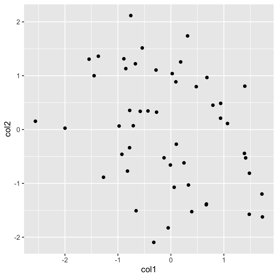
FIGURE 2.8: Scatter plot with ggplot2
Now, let’s re-create the histogram we created before. For this, we will start again with the ggplot() function. We are interested only in the x-axis in the histogram, so we will only use one column of the data frame. Then, we will add the histogram layer with the geom_histogram() function. In addition, we will be showing how to modify your plot further by adding an additional layer with the labs() function, which controls the axis labels and titles. The resulting plot from the code chunk below is shown in Figure 2.9.
ggplot(myData, aes(x=col1)) +
  geom_histogram() + # map x and y as points
  labs(title="Histogram for a random variable", x="my variable", y="Count")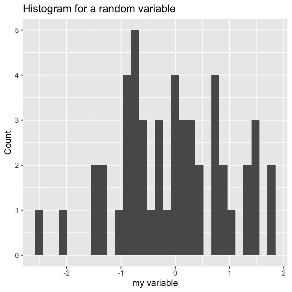
FIGURE 2.9: Histograms made with ggplot2, the left histogram contains additional modifications introduced by labs() function.
We can also plot boxplots using ggplot2. Let’s re-create the boxplot we did in Figure 2.5. This time we will have to put all our data into a single data frame with extra columns denoting the group of our values. In the base graphics case, we could just input variables containing different vectors. However, ggplot2 does not work like that and we need to create a data frame with the right format to use the ggplot() function. Below, we first concatenate the x and y vectors and create a second column denoting the group for the vectors. In this case, the x-axis will be the “group” variable which is just a character denoting the group, and the y-axis will be the numeric “values” for the x and y vectors. You can see how this is passed to the aes() function below. The resulting plot is shown in Figure 2.10.
# data frame with group column showing which
# groups the vector x and y belong
myData2=rbind(data.frame(values=x,group="x"),
              data.frame(values=y,group="y"))

# x-axis will be group and y-axis will be values
ggplot(myData2, aes(x=group,y=values)) +
         geom_boxplot()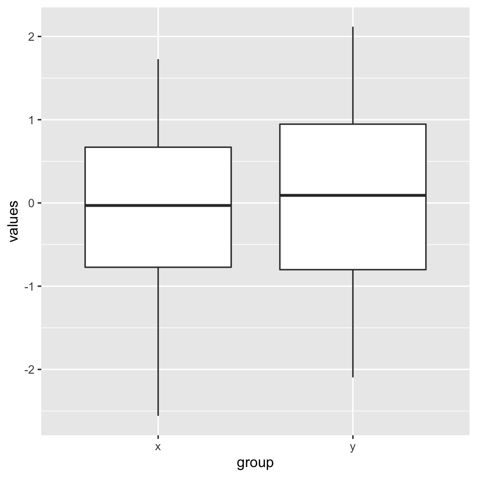
FIGURE 2.10: Boxplots using ggplot2.
2.8.1 Combining multiple plots
There are different options for combining multiple plots. If we are trying to make similar plots for the subsets of the same data set, we can use faceting. This is a built-in and very useful feature of ggplot2. This feature is frequently used when investigating whether patterns are the same or different in different conditions or subsets of the data. It can be used via the facet_grid() function. Below, we will make two histograms faceted by the group variable in the input data frame. We will be using the same data frame we created for the boxplot in the previous section. The resulting plot is in Figure 2.11.
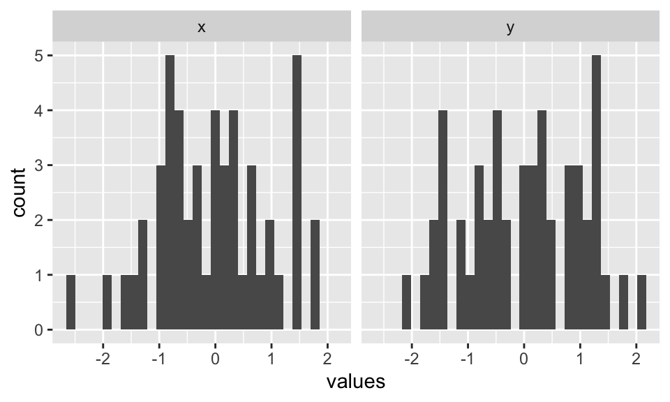
FIGURE 2.11: Combining two plots using ggplot2::facet_grid() function.
Faceting only works when you are using the subsets of the same data set. However, you may want to combine different types of plots from different data sets. The base R functions such as par() and layout() will not work with ggplot2 because it uses a different graphics system and this system does not recognize base R functionality for plotting. However, there are multiple ways you can combine plots from ggplot2. One way is using the cowplot package. This package aligns the individual plots in a grid and will help you create publication-ready compound plots. Below, we will show how to combine a histogram and a scatter plot side by side. The resulting plot is shown in Figure 2.12.
library(cowplot)
# histogram
p1 <- ggplot(myData2, aes(x=values,fill=group)) +
        geom_histogram()
# scatterplot
p2 <- ggplot(myData, aes(x=col1, y=col2)) +
  geom_point()

# plot two plots in a grid and label them as A and B
plot_grid(p1, p2, labels = c('A', 'B'), label_size = 12)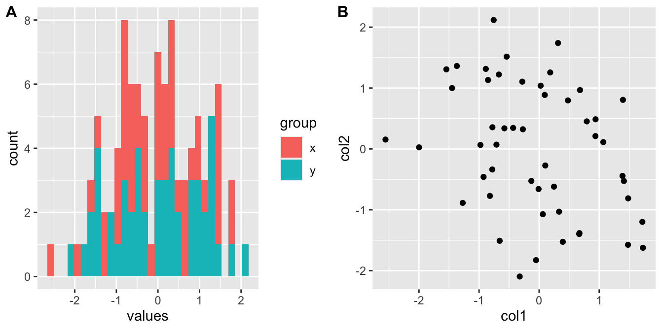
FIGURE 2.12: Combining a histogram and scatter plot using cowplot package. The plots are labeled as A and B using the arguments in plot_grid() function.
2.8.2 ggplot2 and tidyverse
ggplot2 is actually part of a larger ecosystem. You will need packages from this ecosystem when you want to use ggplot2 in a more sophisticated manner or if you need additional functionality that is not readily available in base R or other packages. For example, when you want to make more complicated plots using ggplot2, you will need to modify your data frames to the formats required by the ggplot() function, and you will need to learn about the dplyr and tidyr packages for data formatting purposes. If you are working with character strings, stringr package might have functionality that is not available in base R. There are many more packages that users find useful in tidyverse and it could be important to know about this ecosystem of R packages.
Want to know more ?
ggplot2has a free online book written by Hadley Wickham: https://ggplot2-book.org/
- The
tidyversepackages and the ecosystem is described in their website: https://www.tidyverse.org/. There you will find extensive documentation and resources ontidyversepackages.
This is a concept developed by Leland Wilkinson and popularized in R community by Hadley Wickham: https://doi.org/10.1198/jcgs.2009.07098↩︎